Hiya AI Phone App Launch
Leading AI Product Design from 0 to 1 — and the Decisions That Shaped It
Phone calls haven't changed much since the smartphone era began. Our team saw an opportunity to use AI to bring real value back to them — protecting users from fraud, reducing uncertainty about unknown callers, and turning conversations into something more useful than a missed note. This is the story of how we built it, and the leadership decisions that defined what it became.
The opportunity
The stock dialer apps for iOS and Android had barely evolved in a decade: receive calls, make calls, see a log. Meanwhile, Hiya had spent years building industry-leading technology for spam detection and, more recently, real-time AI voice fraud detection. The question wasn't whether there was an opportunity to build something better. It was what "better" should actually mean.
There was no brief. No predefined scope. The engineering team was excited and capable, and the business had the technology to back it up. My job — alongside the CPO and VP of Technology — was to figure out what we should build and why.
Team Leadership
Escaping ambiguity by defining the direction
At the project's inception, I led the initial design exploration – not from a spec, but from a question: what would it mean to make phone calls genuinely useful again? Over several weeks, I ran exploratory design iterations, investigated technical constraints with engineering, and synthesized research to identify where real user value lived.
This was genuinely collaborative work at the leadership level. The CPO and VP of Technology were deeply involved throughout, and the product vision that emerged was a shared one. My contribution was to make the abstract concrete: turning early ideas into design concepts that the team could react to, pressure-test, and build on.
Once the vision was clear enough to execute, I brought in one of my Principal Product Designers to lead the build. My role shifted to strategic oversight: shaping direction, protecting design quality, and making the calls that required cross-functional alignment.
Leading a 0-to-1 project without a brief requires a different kind of leadership than executing against a roadmap. The most important skill isn't design — it's knowing how to create enough structure for a team to move forward without closing off the right possibilities too early.
Design Leadership
Two decisions that defined the product
On a 0-to-1 project with shared leadership and real ambiguity, the decisions that matter most aren't the ones in a design file — they're the ones about direction, tradeoffs, and what kind of product you're trying to be. Two in particular shaped the outcome.
Making the case
Holding the line on humanization
The aesthetic direction and plain-language copy weren't universally embraced at first. The CPO and VP of Engineering – both closely involved in this project – pushed back on both.
Their instinct was rooted in a "fewer words, cut to the chase" philosophy, and a concern that the visual direction looked too different from apps they were familiar with. These are legitimate perspectives, and I took them seriously. But I believed the pushback was rooted in unfamiliarity rather than a user need, and that the design rationale was sound: phone calls are fundamentally human interactions, and the app should reflect that.
They came around. And by launch, they were enthusiastic about the direction. That outcome matters, but so does the process: it's not about winning arguments, it's about building enough shared understanding that the right decision becomes obvious to everyone in the room.
Shipping and learning
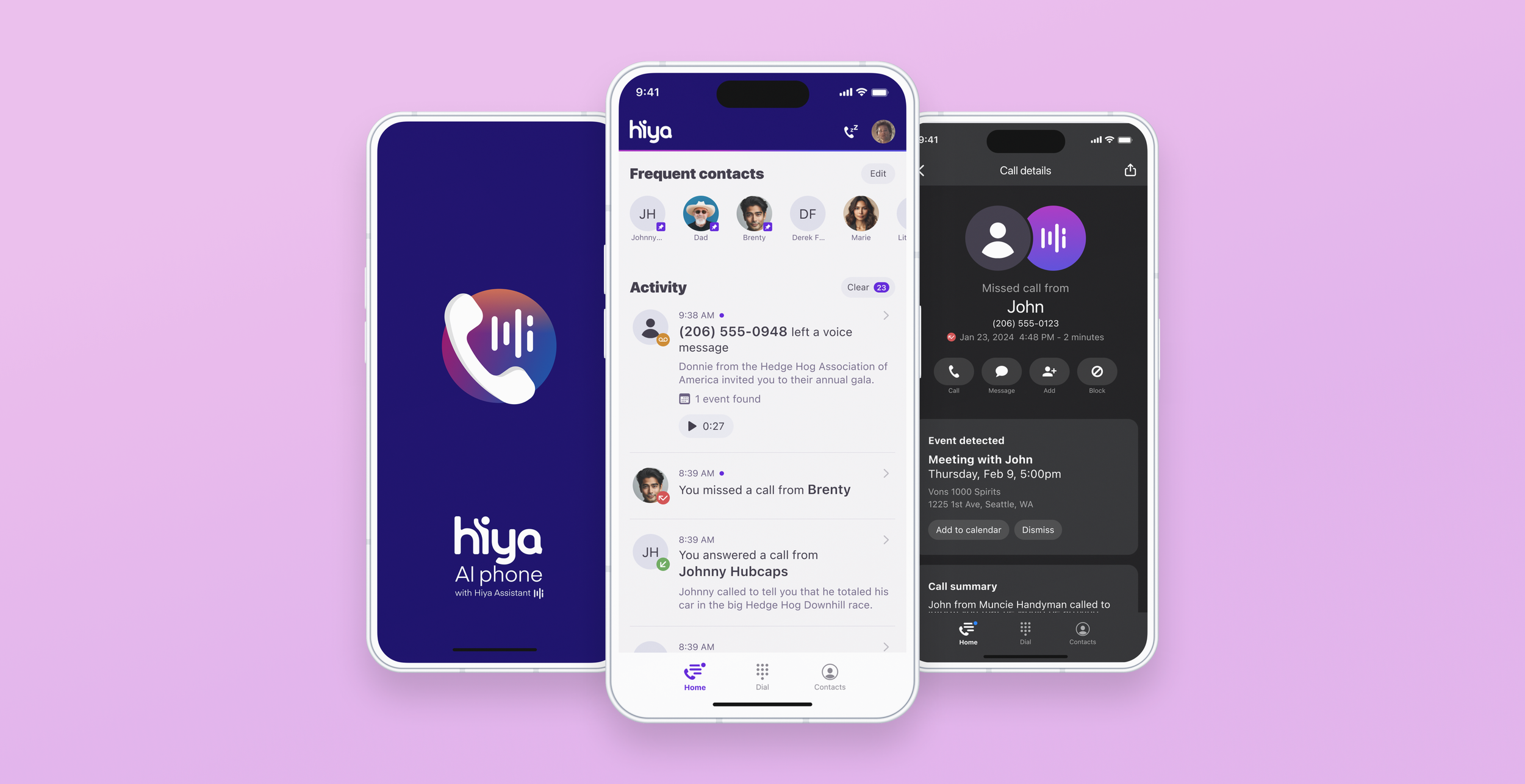
Hiya AI Phone launched on iOS and Android with a focused set of capabilities built around a single idea: reduce the uncertainty and friction that makes people dread their phones.
The app provides contextual information about incoming calls before users decide whether to answer, silences spam using Hiya's best-in-class detection, identifies AI deepfake voices in real time to warn users of fraud, and uses AI to extract and surface the most useful details from a user's calls – including creating calendar events from conversations, automatically.
The product is in active development, with an expanding feature set building on the foundation the team established at launch.
Building on user research, beta test programs, and feedback from existing users, we’re iterating to find product-market fit and deliver experiences that make communication more productive for our core users.
Screen selections
Light mode


Screen selections
Dark mode


Screen selections
“Hiya AI Classic” mode


